
Discover! 100 new colours
NCS 2050
Announcing 100 new NCS Standard colours
Perfect for interior, exterior and product design. We are adding 100 new NCS Standard colours in the low chromatic colour area to offer more options and greater control when working with these colours.
Low chromatic colours are very important in architecture, interior design, and product design. When looking at colour samples representing this colour area, it is often difficult to distinguish between one colour and the other. Is there a perfect white? How do I choose between different greige colours to get the right nuance? Is this too grey, or too beige? What gives that dark colour a slight tint of seriousness? A little chromaticness has the power to create a feeling that a neutral colour cannot do, and slight differences in nuance or hue can make a major impact on the final design. NCS – Natural Colour System® is now more complete and more inspirational.
“The low chromatic colours are constantly in our top list regarding best-selling colours.”
— Ingela Koski-Vähälä,
Portfolio Manager, NCS Colour
100 NEW COLOURS, NEW DESIGNS AND FEATURES
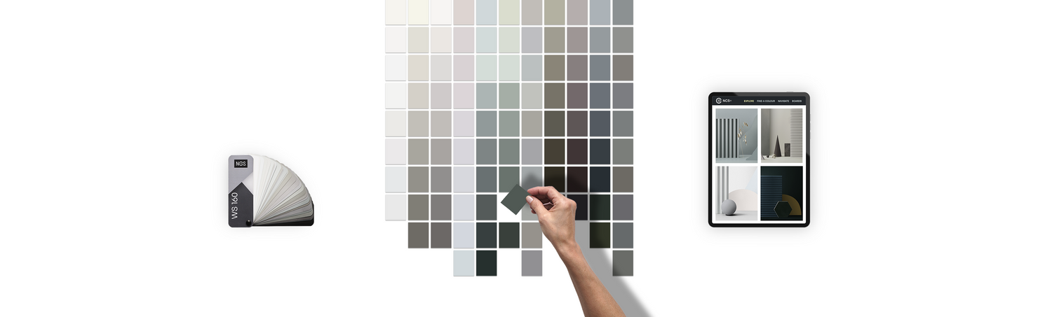
New and updated NCS Design Tools
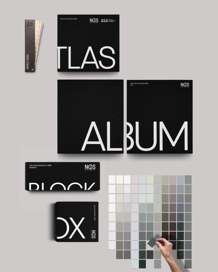
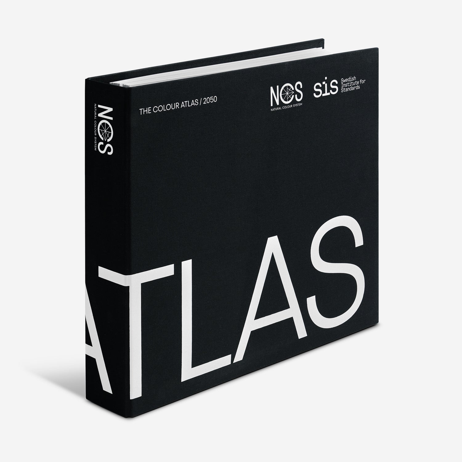
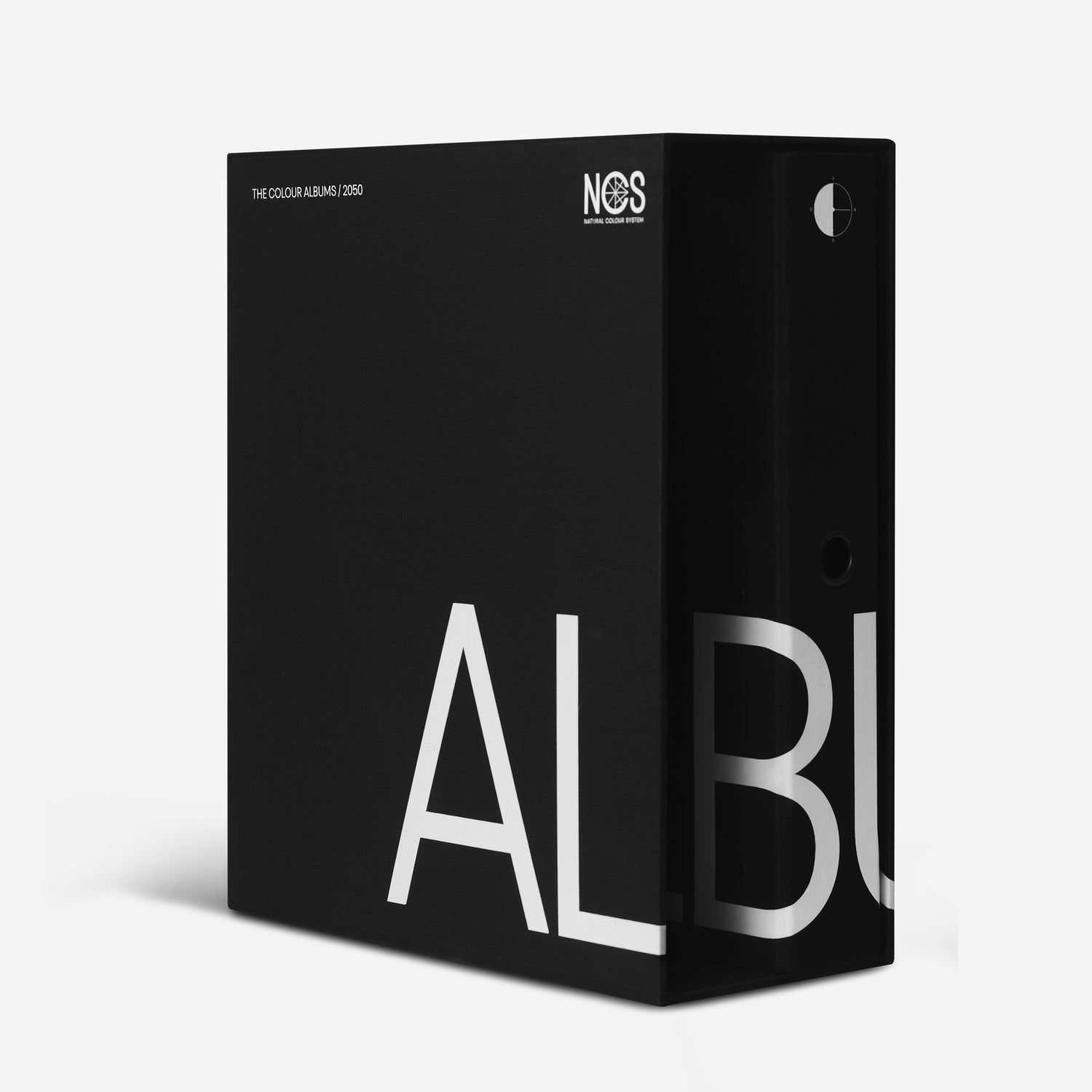
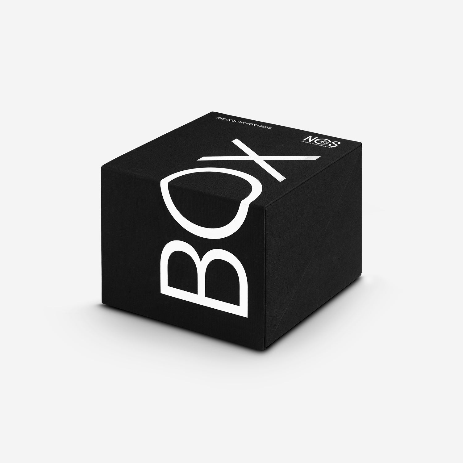
With the update of 100 new NCS Standard colours, also comes updates to our Design Tools. We are now launching new versions of our popular products such as NCS Index, NCS Atlas, NCS Album, NCS Block and NCS Box, with better usability, new design, and of course, the addition of 100 new colours.
NCS Collaborators
See our 100 new colours in use
Influencers Design by Cilla and Silvia Stella Osella uses a selection of our 100 new colours in their projects.


Four colour areas
The 100 new NCS Standard colours are divided into four colour areas. Low chromatic colours are the most frequently used colours in NCS apart from the true neutrals. The new colours focus on hues between yellow and red. This area of the NCS colour Circle includes beige and brown (as a nuance of orange) and pink (nuance of red). Furthermore, “White” is an extremely important colour. Even though there are countless white shades on the market, most of them have between 05 to 10 in Blackness and 00 to 02 in Chromaticness in NCS. For this reason, we are adding two new nuances in this space, 0601 & 1001, which correspond to the most sold whites, apart from the current Standard NCS.
Colour samples represents each colour area


COLOUR AREA
White Delight
Tinted whites are colours with a slight chromaticness. They are very popular and increase your possibilities to be “on” colour, but still, give the feeling of being light and fresh. Within this area, we are launching 16 new hues, going from -R to G50YWe are also launching two brand new nuance positions in the NCS Circle; NCS S 0601 and NCS S 1001. This area will include ten 10 colours, which we refer to as off-whites.
hero colour
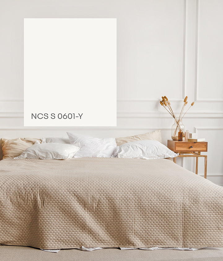
Prime White
White makes our spaces light, open and big. The white area is also the area where our colour perception is the most sensitive. We can perceive very small colour differences in this light area. Therefore, we are introducing brand-new Y, R, B and G 0601 and 1001 colours, to give users greater control when choosing these colours. Here, you find Prime White, NCS S 0601-Y, the perfect choice for a warmer white.
Colour area
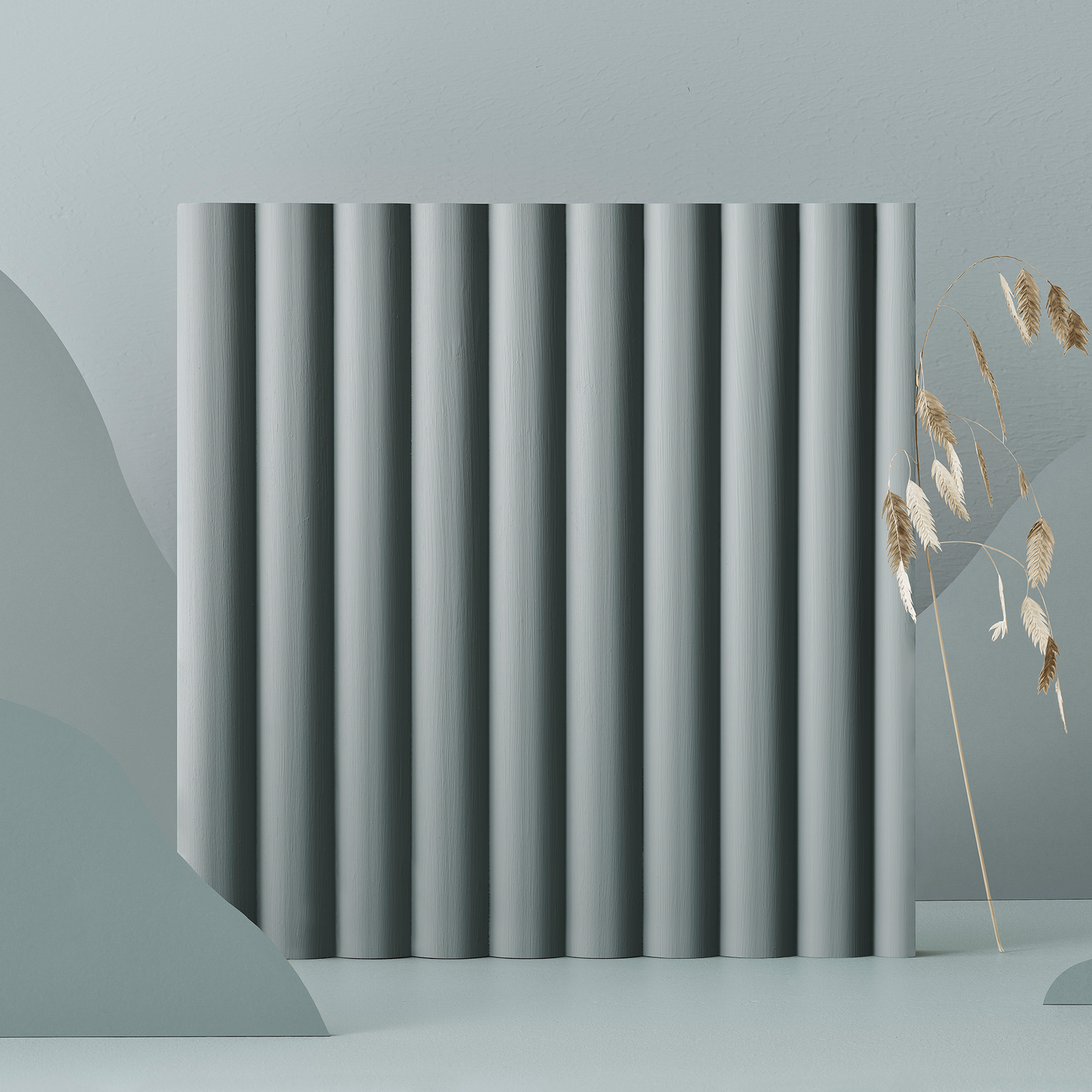
Nordic Midtones
This colour area consists of warm and elegant colours that are a little darker and more colourful. They are strongly linked to Nordic design and the northern hemisphere, where the natural light comes in from an angle that gives the colours a “dark character”, with high blackness in relation to colour. Nordic design often consists of these colours, a scale that is useful and sought after.

hero colour
Nordic Green
我们的新北欧绿色,nc 3005 - b50g年代,是性能ect representation of this calm Nordic dusk and dawn colour of the Nordic nature. These mid-tones indulge us in a mood of calm, relaxation and closeness to nature without having colours that are perceived as either chromatic or neutral.
Colour area
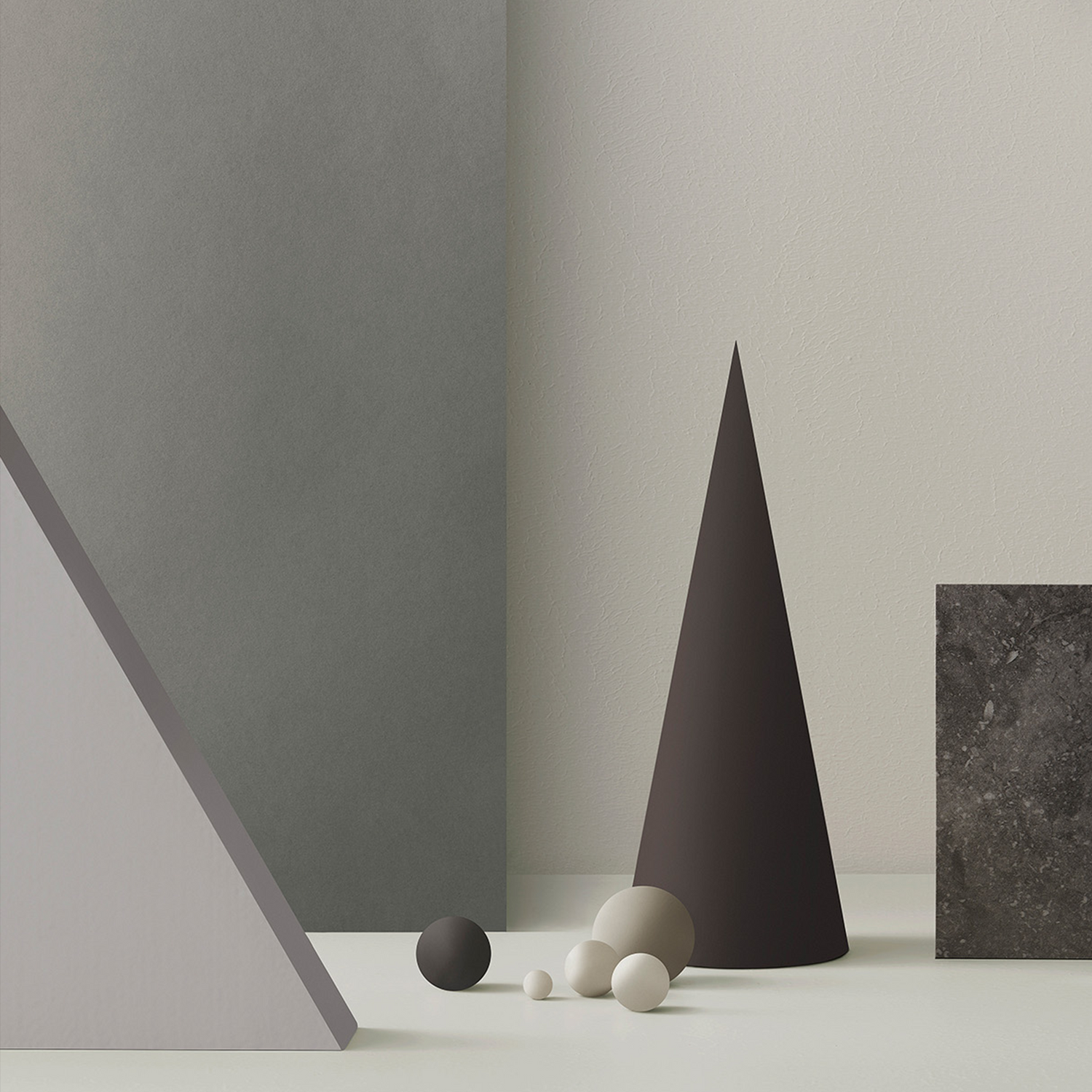
Great Greys
In recent years, light, white colours have been very popular, along with the Scandinavian decoration style. We now see that we are slowly moving a bit towards more colourful areas, albeit toned down. The perfect balance in this colour area is greige. Greige consists of a scale between grey and beige. The search for the perfect greige is constantly spinning in interior design threads and blogs. In NCS, it lies between Y20R and Y30R, somewhere between wheat fields, reddish tones and sand. Here is an area that we have filled in with new Standard colours to be able to offer the perfect greige.
hero colour
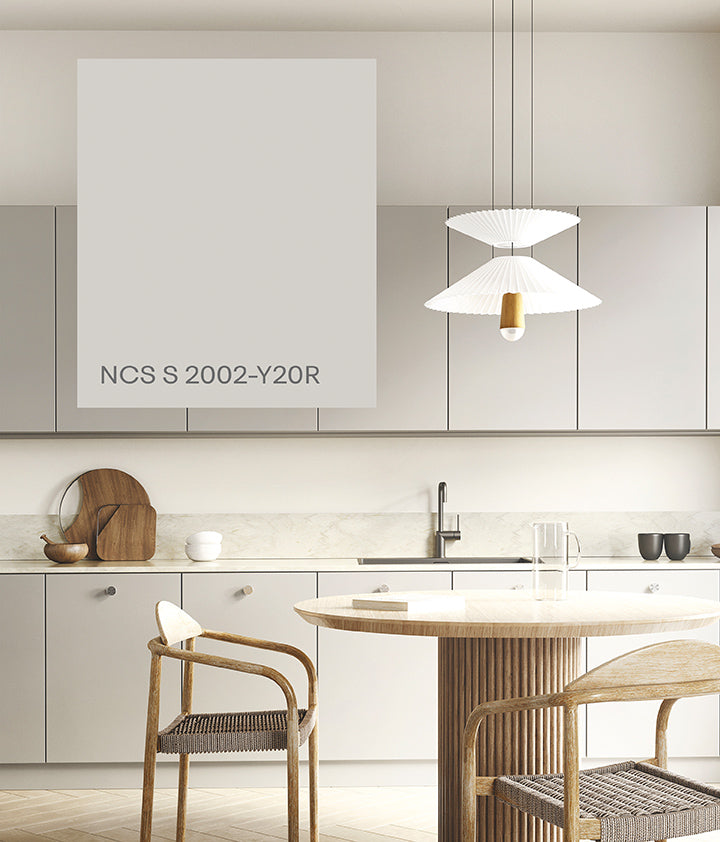
Soft Greige
Greige is a colour that has a hue between Y and R but is very low chromatic, with only 2% of chromaticness. There are light greige, mid-greige and dark-greige variations. After a thorough market analysis, we have decided to launch our own perfect greige; a light greige that we call Soft Greige, with the notation NCS S 2002-Y20R.
Colour area
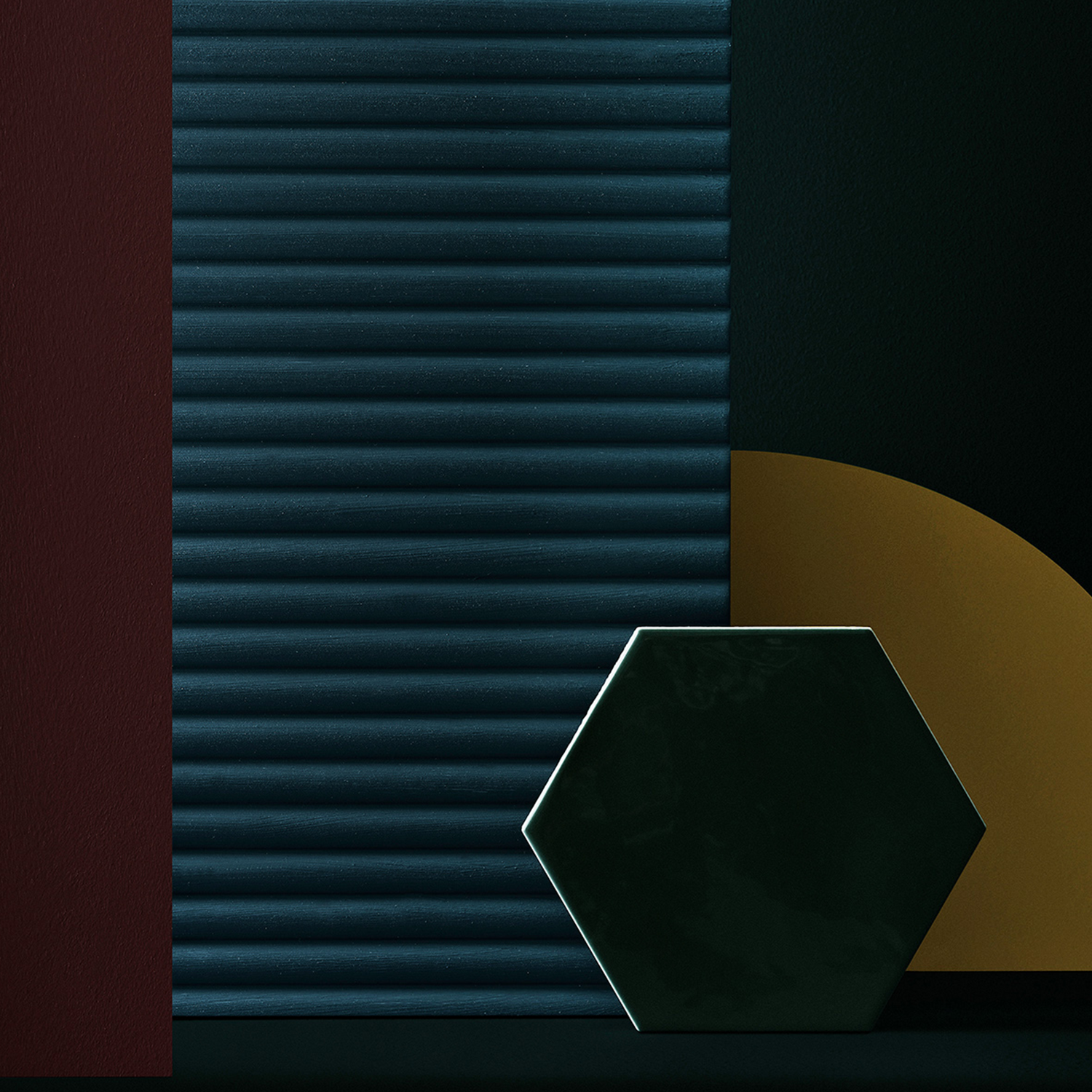
Blackish Elegance
当黑人不再是黑色的,但优雅的黑暗的有限公司lours with a touch of chromaticness. These colours give a very modern and contemporary feeling. The palette enhances the sense of luxury and mysticism. The colours are perfect to emphasise lighter and more chromatic details.
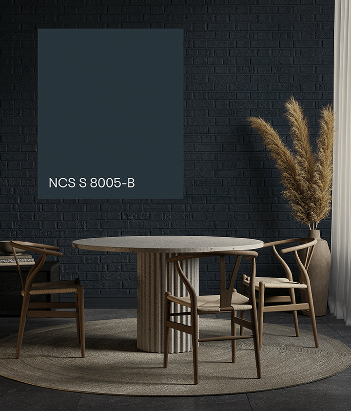
hero colour
Midnight Blue
This new range of Blackish shades of different hues invites you to make your design very exclusive. The key colour of this range, Midnight Blue, NCS S 8005-B, is the perfect start.
Working with a global design community
The 100 new Standard colours are the result of a joint effort between NCS Colour and our global community of colour professionals, to improve the NCS System even further. New technology has enabled us to produce colour samples in completely new nuances with low chromaticness. These have never before existed in the NCS Standard colour range.
“We take pride in constantly working to improve the Natural Colour System and its physical and digital representations. Adding 100 new Standard colours is an important milestone for us.”
– Elin Askfelt, CEO, NCS Colour
From a user perspective
Watch a conversation between Susanna Wåhlin, Note Design Studio and our product developer about NCS Colour having developed 100 new Standard colours. The conversation is moderated by Stefan Nilsson, TrendStefan.
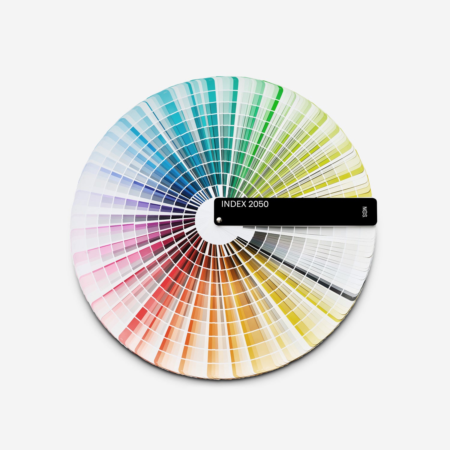
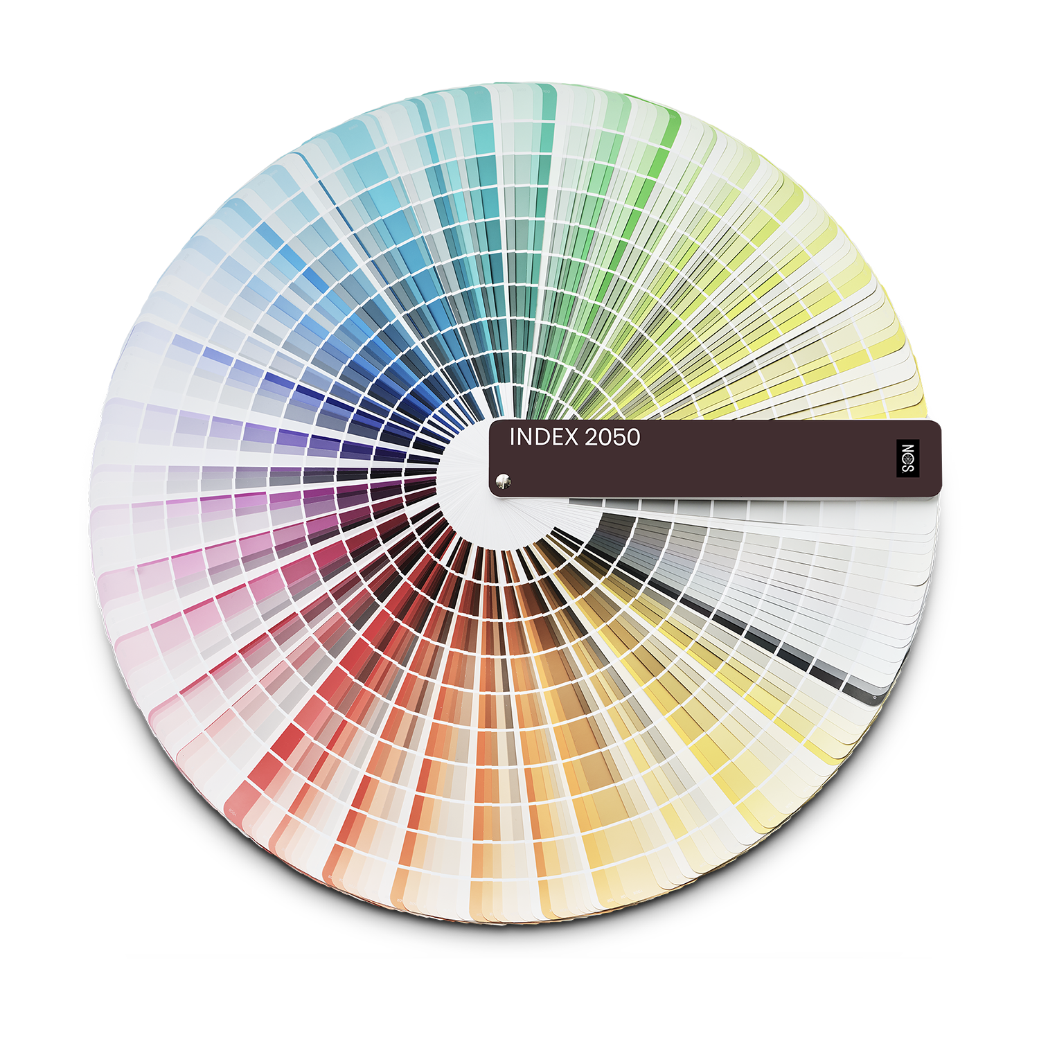
NCS Index 1950 becomes NCS Index 2050
NCS Index is the most popular NCS Colour product, used by colour professionals and enthusiasts globally. Now, we have created an even better NCS Index. Based on feedback from thousands of users and numerous user tests, a new NCS Index has entered the market. With the addition of 100 new NCS Standard colours, the NCS Index 1950 has turned into NCS Index 2050.
100 NEW COLOURS, NEW SORTING AND FEATURES
Index 2050
NCS Index 2050 has a completely new sorting, which makes it faster for a user to find a colour and easier to understand the flow of colours. The new design is also packed with improvements and neat design solutions for the experienced user. Find and visualise an NCS Standard colour quick and easy with this essential colour fan. NCS Index is perfect to carry along as a complete colour reference tool. The most used low chromatic white, grey and black colours are gathered in one separate section for easy access and usability.
- 100 new NCS Standard colours
- New cover design and sorting
- New features and improvements