Good or bad, nice or ugly?
一个PRIL, 2020
一个uthors: Per Jutterström, NCS Colour, Katrin Nyman, NCS Colour

Exterior colour design by private houseowners in the northern part of Sweden.
为什么一些颜色要比其它的更吸引人呢?一个re there principles that can be applied to the use of exterior colours? Exterior colour design will always be public and accessible for people in the area of the object. It will create feelings and sensations. It can be considered as good or bad colour design. It can be described as nice or ugly. All depending on the context like the surroundings, the light, the season - these factors will be discerned by the observer.
By tradition private houses in Sweden have been painted mainly in red but also in whiteish and yellowish tones. Due to technical limitations, historical background and from a practical point of view, these colour areas were accessible for the private house owners and from an aesthetic aspect, also suitable in the Swedish landscape.
一个s a result of the development in tinting of paint, where the modern tinting technology now can almost produce any colour shade, the range of colours has extended to other areas. New areas of off-whites, pastels and more chromatic colours have become more used by Swedish private houseowners. As a result, the selected exterior colours are now challenging the observer in a different way than what we are used to.
In this article we will present two different private houses, where the choice of exterior colour differs from the traditional colour scheme and how this makes the houses appear “awkward” in comparison with other houses. We will also give you some practical advice as what to consider when choosing an exterior colour.
We perceive colours differently
Exterior colour design can be carried out in different ways, but it always has a context. The object itself has its opportunities due to its shape, volume, style, material and origin. But it is also placed in a context where other aspects such as geography, history, the influx of light and its surroundings are adding information to the appearance. Our judgement of the colour will be based on all these parameters.
The most common exterior colour in northern Sweden
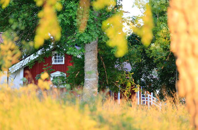
Sweden is a country with distinct changes in season, especially in the northern parts. There are lush green summers, brownish autumns, snowy white winters and pristine yellow-green springs. Swedish private houses have a wide tradition of certain exterior colours that have been used over the years. In these northern parts, exterior colours have traditionally been low in chromaticness and high in blackness. The result of this is a modest palette that does not interfere with other houses or nature. In the remote areas, the “Falu-red”, an iron-oxid waterbased paint, has been one of the most common façade colours.

Falu-red is a colour with some variations in the deep reddish area which can be illustrated best with NCS S 4550-Y70R. This colour would in figures be the most used façade colour for private houses in northern Sweden over the last two centuries. Apart from aesthetical reasons, where Falu-red is a perfect match with the colours of the Swedish nature during summer as well as for the other seasons, it has a preservative and protective factor in its paint. Also, it has been available and affordable for centuries.

Falu-red has been, together with other traditional pigments, the main palette together with yellowish-brownish-reddish colours. However, over the last decades the Swedish exterior colour palette has been widened into other colour areas, mainly due to technical developments. This means that colours with higher chromaticness are now available in paint products for exterior use.
The case – two different houses
We will now look into two different houses, where the choice of exterior colour is more untraditional than usual. The objects, both being private houses without any close neighbouring houses, simply do not fit into the traditional colour scheme and also not into the main historic tradition.
The objects have been studied in normal daylight conditions. The façade colours have been measured by NCS colour reader Colourpin II, and then a visual comparison has been made with a NCS colour sample directly on site.
In addition to the actual investigation of the inherent colour, some questions were addressed to the owners of the houses: Who chose the exterior colour? What made you select this particular colour? On what information and background was your decision made?
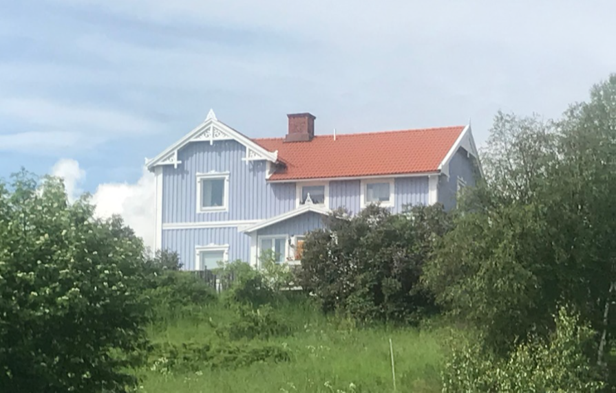
OBJECT NR 1
Inherent colour NCS S 1040-Y40R, intended colour by the houseowner ≈ S 2030-Y40R and the perceived colour from the distance ≈ S 0550-Y40R.

House object nr 1, Svarvarböle.

OBJECT NR 2
Inherent colour NCS S 1020-R70B, intended colour by the houseowner ≈ S 2005-R70B and the perceived colour from the distance ≈ S 0525-R70B.
House object nr 2, Älandsbro.

Blue colours for exteriors are very rare in northern Sweden and only used occasionally for small details, such as doors or window frames and cannot be considered a part of any traditional colour scheme.
Conclusion
一个nswers given made it clear that the initial aim for the selected colour by the houseowners were intended to have a more muted, less chromatic appearance than the final result.
• In both cases, the decision for the selected colour was based on a smaller sample and against a white background.
• Furthermore, the surroundings had not been taken into consideration when the colour was selected including the change of the seasons.
• There were also reasons to believe that advice and guidance from the point of sales had not been sufficient. Over the years there has been a shift from traditional smaller paint shops to bigger do-it-yourself centers that cater everything in the building process. The smaller paint shops are usually managed by colour experienced staff, while at the big centers often no advise is given.
一个ll this has resulted in exterior colours that looks a bit “awkward” when looking upon it traditionally, for a house in northern Sweden. Both selected objects appear too chromatic in all out of its context.
“There were also reasons to believe that advice and guidance from the point of sales had not been sufficient.”
Per Jutterström, NCS Colour
To consider when choosing exterior colour
一个s we have noted with the two houses, the perceived colour will have less blackness than the inherent colour and will therefore be perceived more chromatic.
Hence, it is necessary to compensate the amount of blackness and chromaticness in the process of selecting the colour from a smaller sample. By decreasing the chromaticness with 5-10 units and increasing the amount of blackness with 10-15 units, the perceived colour of the object will coordinate more with the intended colour.
Furthermore, the following circumstances should be taken into consideration:
• THE SURROUNDINGS
Is the building situated in a city or on the countryside? Are there other buildings close-by? How we perceive colour is influenced by what colours the surrounding buildings have, as well as the environment and landscape.
• THE SIZE AND STYLE OF THE BUILDING
There are colour and materials on your building that also have to be taken into consideration when choosing an exterior colour. The bricks on the roof or the window fittings are for example things that affect the overall impact and how we perceive the colour of the house.
• THE INFLUX OF LIGHT
How will the colour be perceived during the day vs the evening? Take care to try the chosen colour on your house on a smaller area. In that way you can see on your own how the colour is perceived differently depending on the light.
NCS PRODUCTS AND SERVICES
一个t NCS Colour, we have developed products and services as well as educational activities to support professionals with their exterior colour work.
COURSE: EXTERIOR COLOUR DESIGN
Participants will learn how to take the surrounding environments, colour phenomena and other challenges that arise in exterior colour design into account and get the tools needed to make successful exterior colour choices.
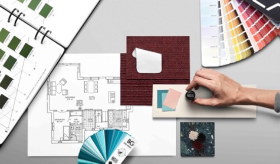
一个s well as education we offer both digital and physical design tools to help professionals in their colour work. A selection of these are:
DESIGN TOOL: NCS EXTERIOR FAN DECK
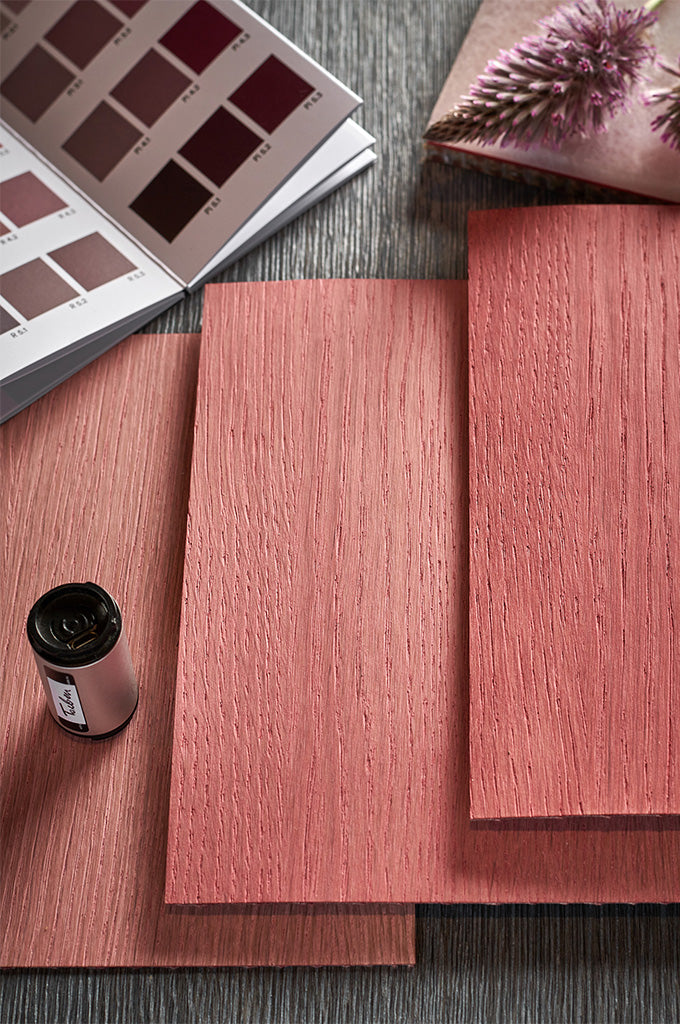
一个s our perception of colours in outdoor environments differ from how we perceive colour indoors, we have developed a colour sample selection of exterior colours. NCS Exterior is a fan deck that contains 322 samples of the most frequently used exterior colour, from matte to semi-matte. NCS Exterior fan deck is available in English, German, French and Swedish.
DESIGN TOOL: COLOURPIN II
With NCS Colourpin you can identify any colour instantly and receive the closest NCS Notation including translations to CMYK, RGB L*a* b* and lightness values. This digital colour reader fits easily in your pocket or briefcase. It is connected via bluetooth to a smartphone application allowing you to collect and identify colours on the go.
For more information regarding our products and services, please contact us at info@www.kalindipandya.com.
一个cknowledgements
This article is based on a study by Per Jutterström, NCS Colour: Good or bad, nice or ugly? – Some exterior colour design by private houseowners in the northern part of Sweden. The study was presented at AIC Midterm Meeting Color and Landscape 2019, Buenos Aires, Argentina.
IMAGES
Per Jutterström, NCS Colour
Hauke Irrgang, Unsplash
一个bby Zavgorodnia, Unsplash
Pontus Wellgraf, Unplash