DESIGN
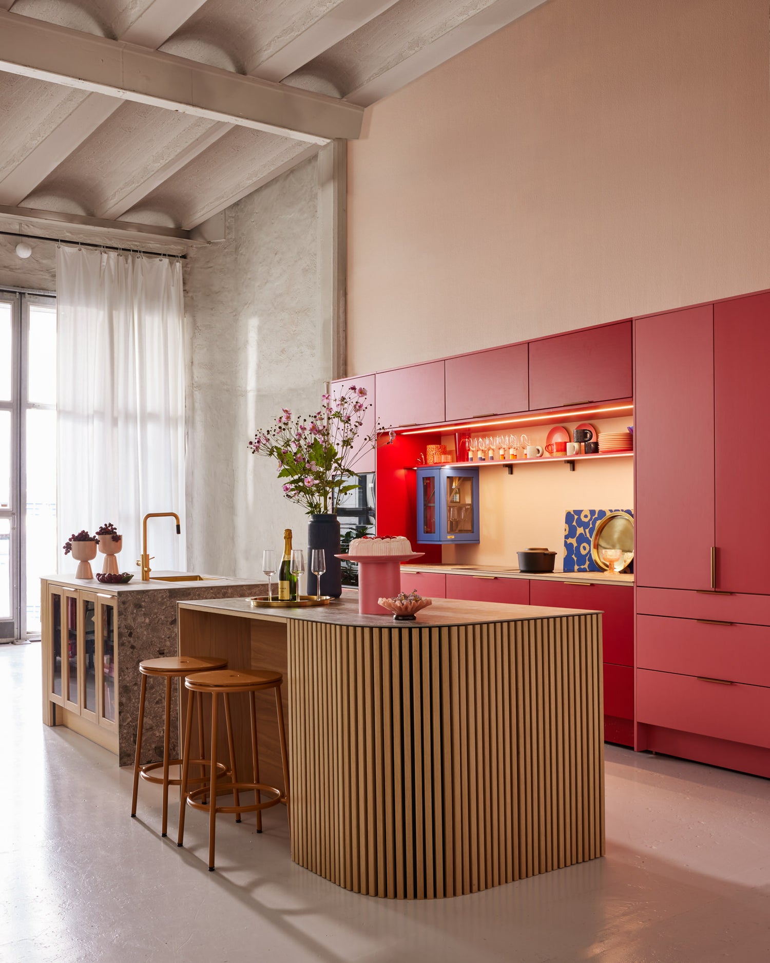
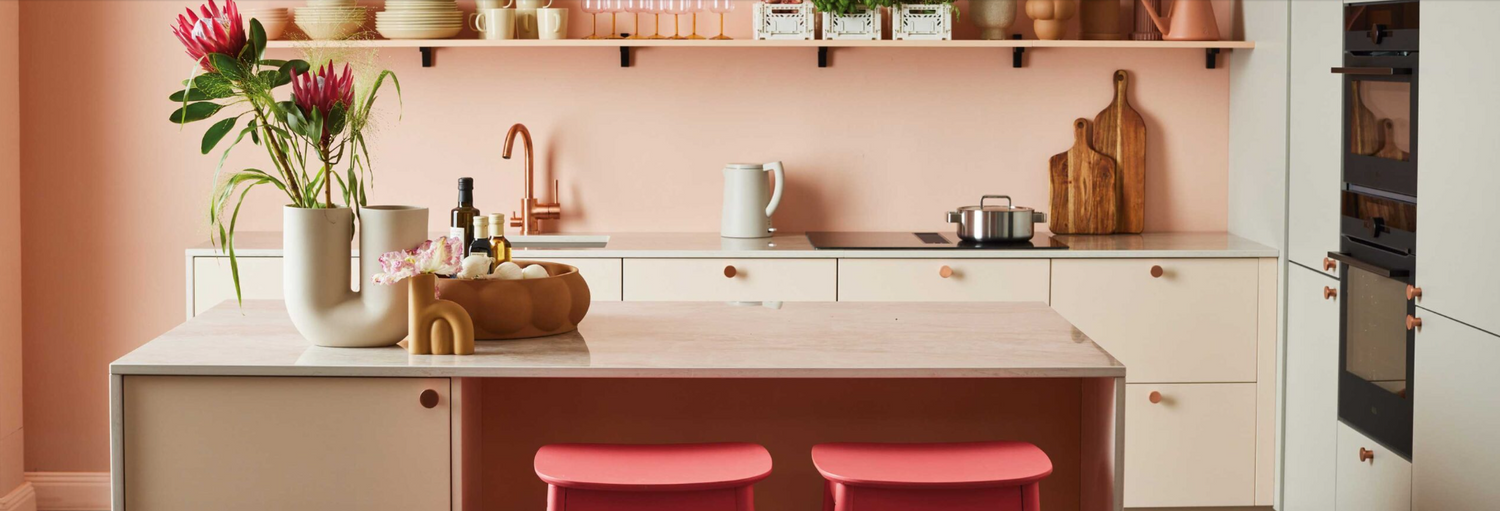
Stop! Discover a red kitchen made by Puustelli–designed using NCS Colour Trends 2024+
SEPTEMBER 26, 2023
Puustelli repeats its success from last year and launches yet again a kitchen with trend colours. The kitchen is designed by Stefan Nilsson, also called Trendstefan, and he has used the palette from NCS Colour Trends 2024+.

 The kitchen is based on the colours from trend direction "Heart / Stop" in NCS Colour Trends 2024+.
这个项目是由乔纳斯Abelsted雷欧和Paulina Kalbori from Puustelli, a renowned, Finnish kitchen company, who has produced high-quality products for over 100 years.
 Paulina Kalbori and Jonas Abelsted Eklund, Puustelli.

The trend kitchen is made of the recyclable model called “Miinus”. Only materials, components, and production methods that are the most sustainable alternative to constructing an industrial kitchen have been selected.

Aligned with future preferences
By creating the trend kitchen, Puustelli aims to head into the future and together with Stefan Nilsson, develop a kitchen which is made for the preferences of tomorrow.
“Perhaps it can seem a little bit unusual to some when we launch this kitchen, but time and the forecasts shows quite clearly in which direction we will go. The trend kitchen places Puustelli well into the trends when it comes to interior design and showcases that we have the means to create bespoke kitchen solutions. The premier launch of the trend kitchen last year was very successful and to us it is only natural to follow up on this.”Jonas Abelsted Eklund, Marketing Manager, Puustelli.

Developing trend colours
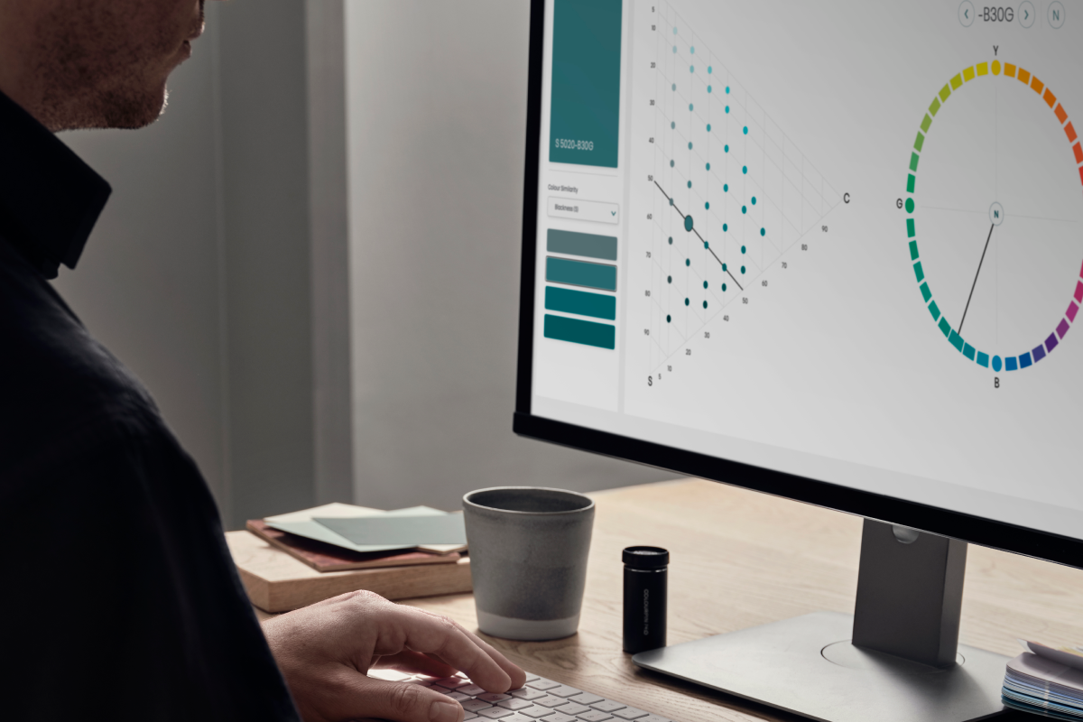
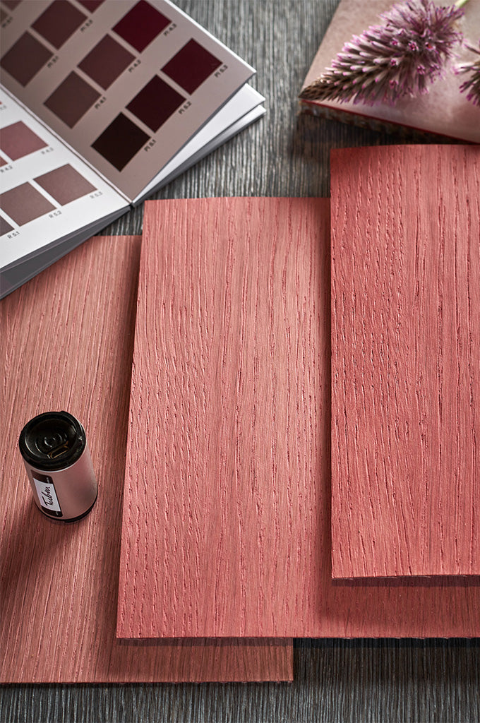
NCS Colour works annually with an international team of colour experts to produce interdisciplinary trend forecasts. These forecasts are made two years in advance, and are based on the movements and directions we see in the world. Whichcolour preferences will be relevant? The result of the joint work is a forecast that includes a total of 24 trend colors, grouped into four palettes. In this process, the NCSSystem is crucial,asit forms a descriptive model and identifies exact colour positions or colour areasofthe hue andthe nuance.
”In our role as colour experts, it is important to always look ahead. Our trend work is a fundamental part in order to help our customers make well-informed, but sometimes also as in this case, bolder colour decisions."
– Elin Askfelt, CEO at NCS Colour
 Elin Askfelt, CEO at NCS Colour and Stefan Nilsson, trend expert.

The Puustelli kitchen is the perfect example of the fact that we are beginning to embrace more and more chromatic colours. We see that pure red (-R) and the very popular reddish blue (-R80B) are taking an important role in our change of colour preferences.
“For 2024, the need for chromatic colours is intensifying, and the pure red colours are the easiests colours to embrace.”
– Karl Johan Bertilsson, NCS Colour
Within the chromatic colour area, pure red colours are the easiest to embrace. It is a colour area representing our urge for action and the intense feelings of wishing for things to happen.
“This is a quite challenging red colour. Almost sensual. And I can see it rapidly increasing in relevance. I have grown up with a red kitchen and I believe it is fun to use these colours again. I think it can be a good colour which both leads our minds to the French bistros, but also being something excitingly new.”says Stefan Nilsson.
Diving deeper into the palette
These colours are grouped into a palette is named Heart/Stop. The most noticeable feature in this palette is the pure red (-R). The space with red wakes us up. But more importantly this pure red, NCS S 1580-R, is a symbol of our most positive, feelings and is a colour that stops all the negative.

“心/趋势方向Stop" from NCS Colour Trends 2024+.
The combination of NCS S 1580-R with the very popular blue NCS S 3050-R80B, is growing in importance in interior design. To balance this chromatic statement, we need to add wood and/or colours reminding us of the material concrete. A paler red is an option to use. This will enhance the importance of red and at the same time create a space that is perceived as sustainable.

Apart from an exciting colour scheme, the kitchen entails not just one, buttwokitchen islands. The rounded corners are a bespoke design feature, which elevate the look and feel of the kitchen as a whole.All in all, Puustelli's work is beautifully designed kitchen that exemplifies and brings the trend direction Heart / Stop of NCS Colour Trends 2024+ to life.
Fun fact: Miinus celebrates 10 years.
Do you want to read more about Puustellis kitchen? Find ithere.
Learn more about NCS Colour Trendshere.